< Back
How-to Easily Create a Step Chart in Excel
Post
A step chart can be useful when you want to show the changes that occur at irregular intervals.These are useful for showing values that don???t change steadily from one point to the next, but that instead are constant for a period of time, then jump to the next level, and are constant for another period of time. For example, step charts are good for showing how things like prices or rates change over time.
Unfortunately, Excel doesn???t have a Step-Chart Type as one of the standard ones, but we can make one with a few steps and restructuring our data.
Before we start, lets look at what some sample data may look like when charted normally. For instance, if you take this data:

and create a line chart from it, your chart will look like this:

This is not an accurate picture of our data. There is no increase in the number of users as shown in a line chart. There is a jump in values and is not a linear change.
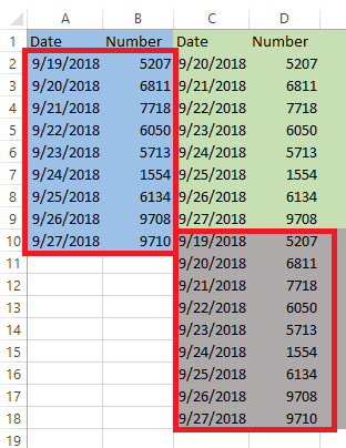
To create a Step Chart we need to copy our data into a new column and create a new data set.
What you need to do is to change your data by adding an additional data point every time your data changes.
Now that we have our data all set, we need to create our chart. It is a simple Line Chart. Select the entire data set, go to Insert ???> Charts ???> 2-D Line Chart.

You should now have your final Excel chart and it will look like this:

This is the 3-step method to create a step chart from your existing data set.
Unfortunately, Excel doesn???t have a Step-Chart Type as one of the standard ones, but we can make one with a few steps and restructuring our data.
Before we start, lets look at what some sample data may look like when charted normally. For instance, if you take this data:
and create a line chart from it, your chart will look like this:
This is not an accurate picture of our data. There is no increase in the number of users as shown in a line chart. There is a jump in values and is not a linear change.
To create a Step Chart we need to copy our data into a new column and create a new data set.
What you need to do is to change your data by adding an additional data point every time your data changes.
- In order to get our extra points, we need intermediate points with the old numbers and the new date, to make the treads and risers of our steps.
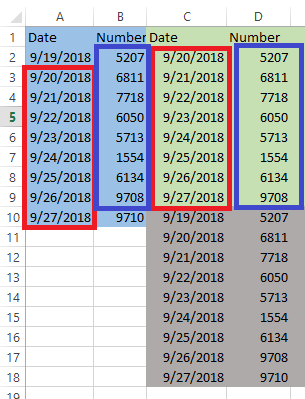
- The easiest way to do that is to remove the first date and last number in the top half of our data, copy the contents as show in the above figure.
- Then copy your original data below this as shown in figure.
Now that we have our data all set, we need to create our chart. It is a simple Line Chart. Select the entire data set, go to Insert ???> Charts ???> 2-D Line Chart.
You should now have your final Excel chart and it will look like this:
This is the 3-step method to create a step chart from your existing data set.